
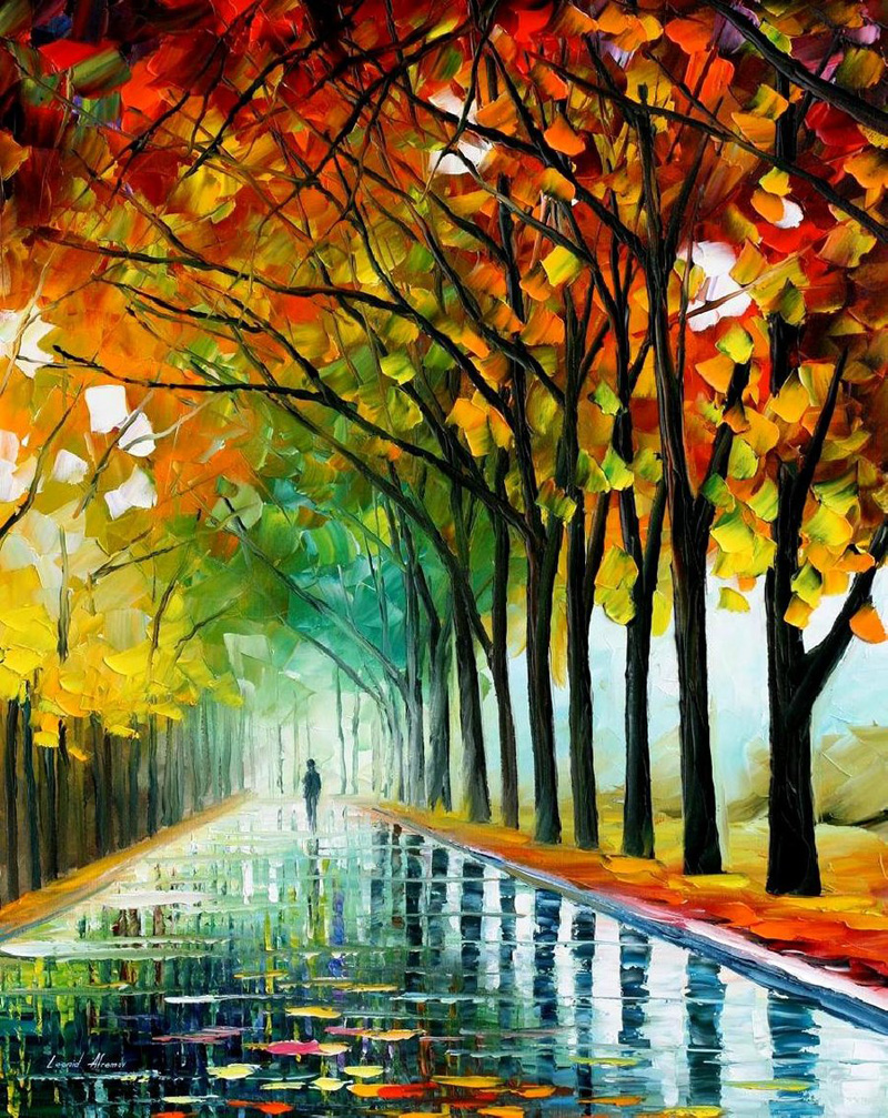
Check out this beautiful oil painting by Leonid Afremov. I love his use of cool warm colour theory to add depth and perspective to his work, and the contrast between the cool background and the warm Autumn leaves in reds and purples in the foreground are really effective. Afremov also uses this technique on the pathway, using vibrant colours in the foreground and adding more and more white the further away the path is, making cooler pastel shades that receed to make the path appear to be longer than it is. I stumbled across his work completely by chance, but I think it's really beautiful and shows a great understanding of the relationships of different colours and the effects they can have on your work.
His effective use of cool warm contrast gives the painting atmosphere, and I especially like the way the dark browns and reds of the tree trunks cut into the brightly coloured Autumn leaves; I think the intertwining branches add even more depth to the painting.


No comments:
Post a Comment