

Thursday, 27 October 2011
Thursday, 20 October 2011
Charles Rennie Mackintosh
I was researching Mackintosh for my architecture cube in this project, and was amazed at how modern and functional his architecture, in particular was. I checked a book out from the library called The Hill House, about a house Mackintosh designed, built and furnished for a wealthy Scottish publisher. Its evident from the interior especially how he was inspired by Japanese art and architecture - shown through his use of grids and contrast between dark structural wood and light translucent glass.

I also looked at The Glasgow School of Art, my favourite room being the Library. I think Mackintosh's greatest success was striking the balance between beauty and functionality. His rooms were atmospheric and intriguing to look at, but they're also practical and spacious. This was one of my favourite boxes to create.
Little Boxes...

One of the areas I chose to develop was the idea of cutting in to my cubes. I looked into packaging which had areas removed, or added to the exterior to add another dimension to a seemingly mundane box. I came across this wonderful packaging design by www.lovelypackage.com. I love the way the box slides out from its cover to show the beautiful white tray with trees and snow cut into it. This company treat packaging as art, and I think it makes the products they sell much more engaging.Cutting into my boxes was one of my favourite things to do, and I was really inspired by Rob Ryan. Although he doesn't work in 3D, I really enjoy how he creates a range of depths and tone just by cutting bits of paper away. I had the chance to meet Rob Ryan at a book signing at the Yorkshire Sculpture Park on the 15th October, and seeing his original works up close was really inspirational.

In my opinion, die cutting or removing material from packaging is one of the most effective things you can do to engage the viewer - people love to be able to pick things up and interact with them, and even though it's a very simple idea, it's very effective when it's done properly, like at Lovely Package.
Thursday, 13 October 2011
Travelling Typography
Tuesday, 11 October 2011

Monday, 10 October 2011

This piece by JMW Turner is one of my favourites. 'Sun Setting Over a Lake' appeals to me more than some of Turners' other works because it's much more abstract. However, even in his more formal landscape paintings, Turner used colour boldly and confidently. Here your eye is immediately drawn to the warm oranges and yellows in the right hand corner, while the cool blues and greys sink away. This contrast gives the painting a moody atmosphere and really helps the viewer imagine the scene at sunset.

Sunday, 9 October 2011
Colour
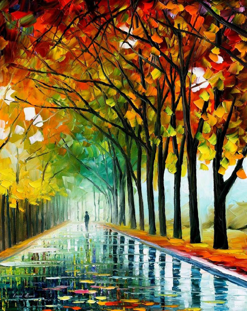
Check out this beautiful oil painting by Leonid Afremov. I love his use of cool warm colour theory to add depth and perspective to his work, and the contrast between the cool background and the warm Autumn leaves in reds and purples in the foreground are really effective. Afremov also uses this technique on the pathway, using vibrant colours in the foreground and adding more and more white the further away the path is, making cooler pastel shades that receed to make the path appear to be longer than it is. I stumbled across his work completely by chance, but I think it's really beautiful and shows a great understanding of the relationships of different colours and the effects they can have on your work.
His effective use of cool warm contrast gives the painting atmosphere, and I especially like the way the dark browns and reds of the tree trunks cut into the brightly coloured Autumn leaves; I think the intertwining branches add even more depth to the painting.
Wednesday, 5 October 2011

Subscribe to:
Posts (Atom)

